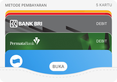
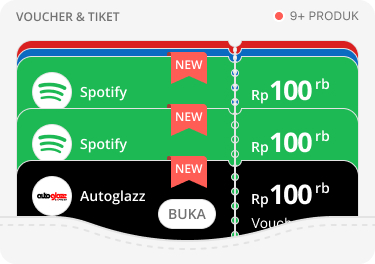
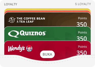
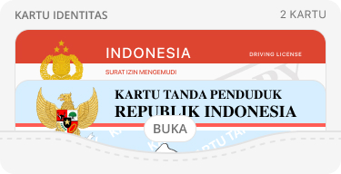
Payment, Ticket & Voucher, Membership, Personal ID, Financial
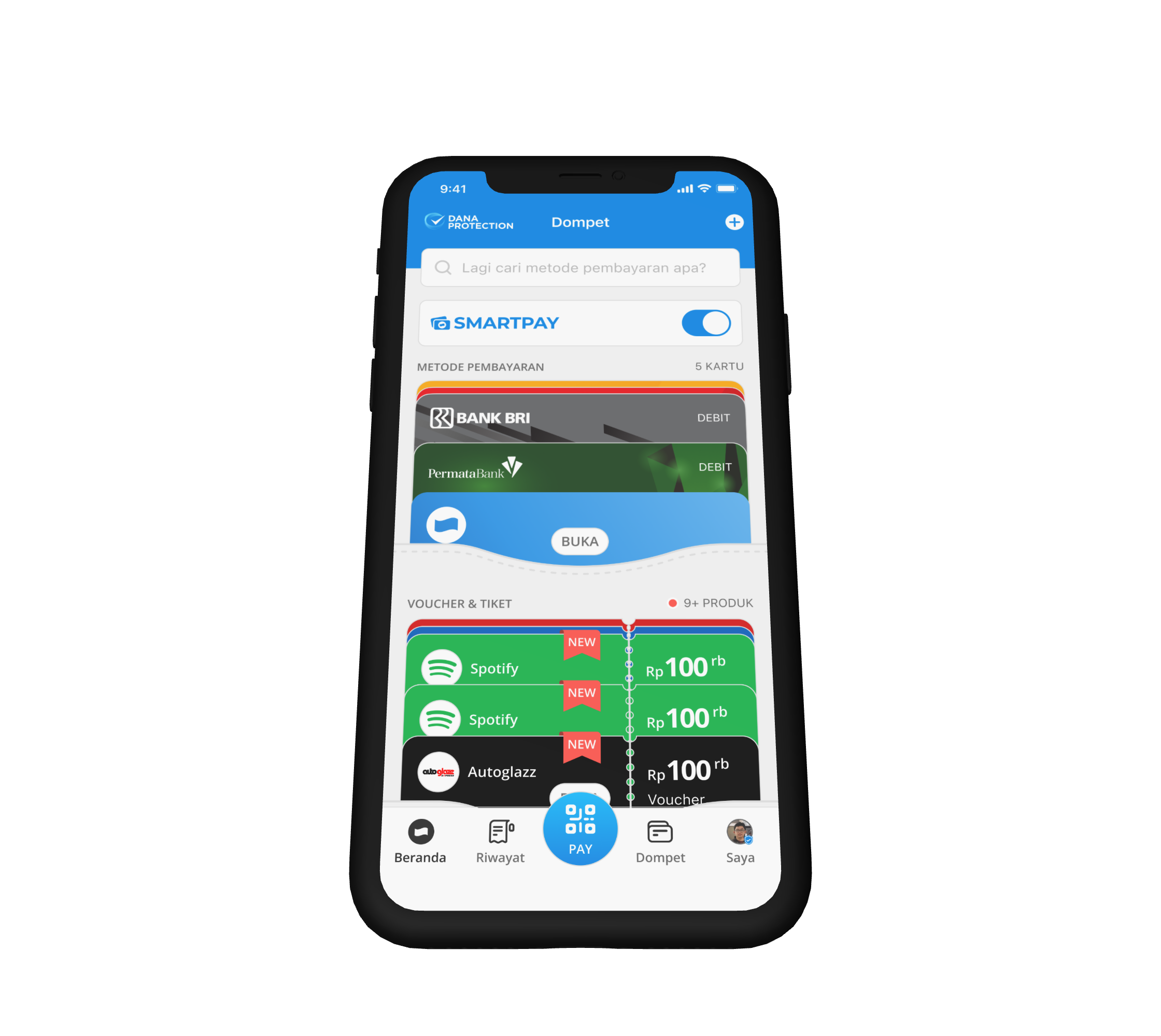
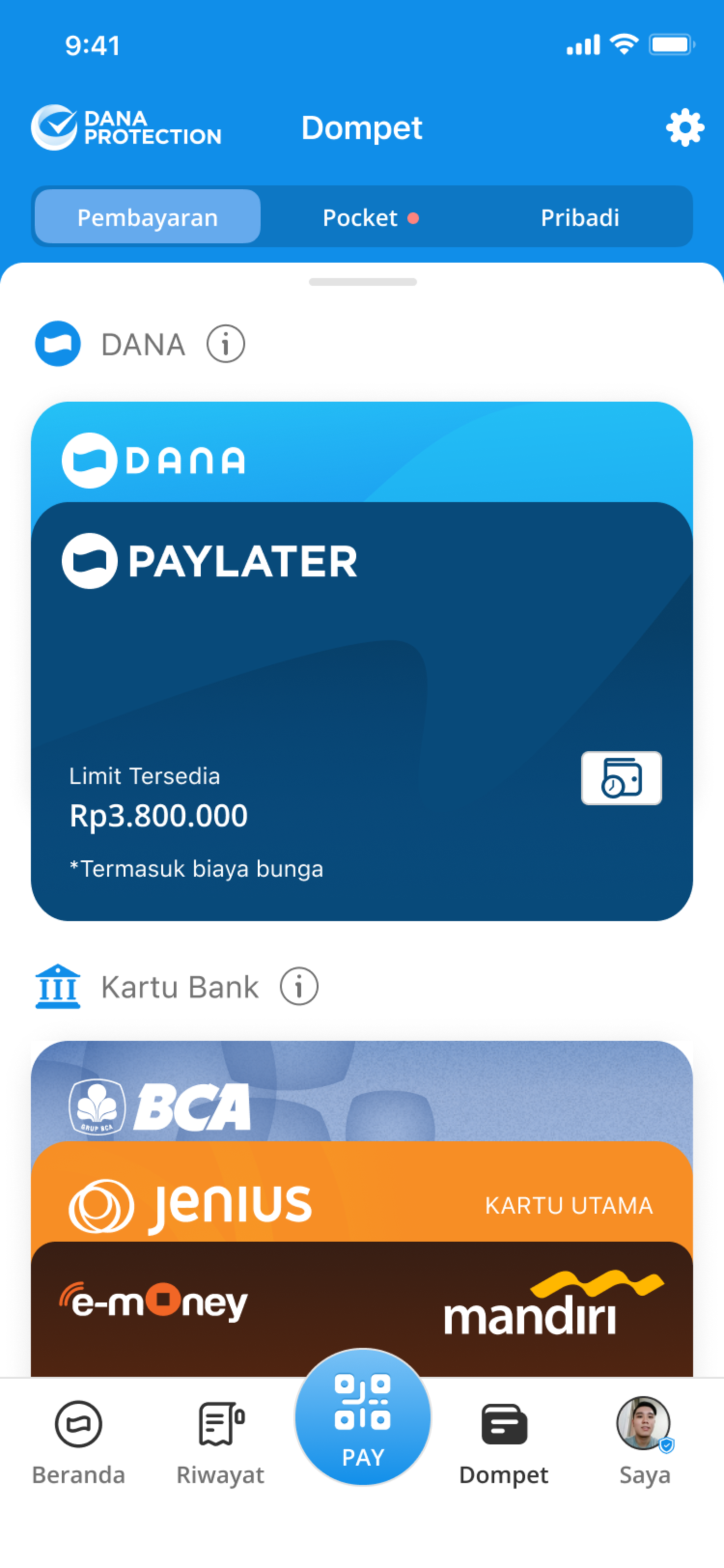
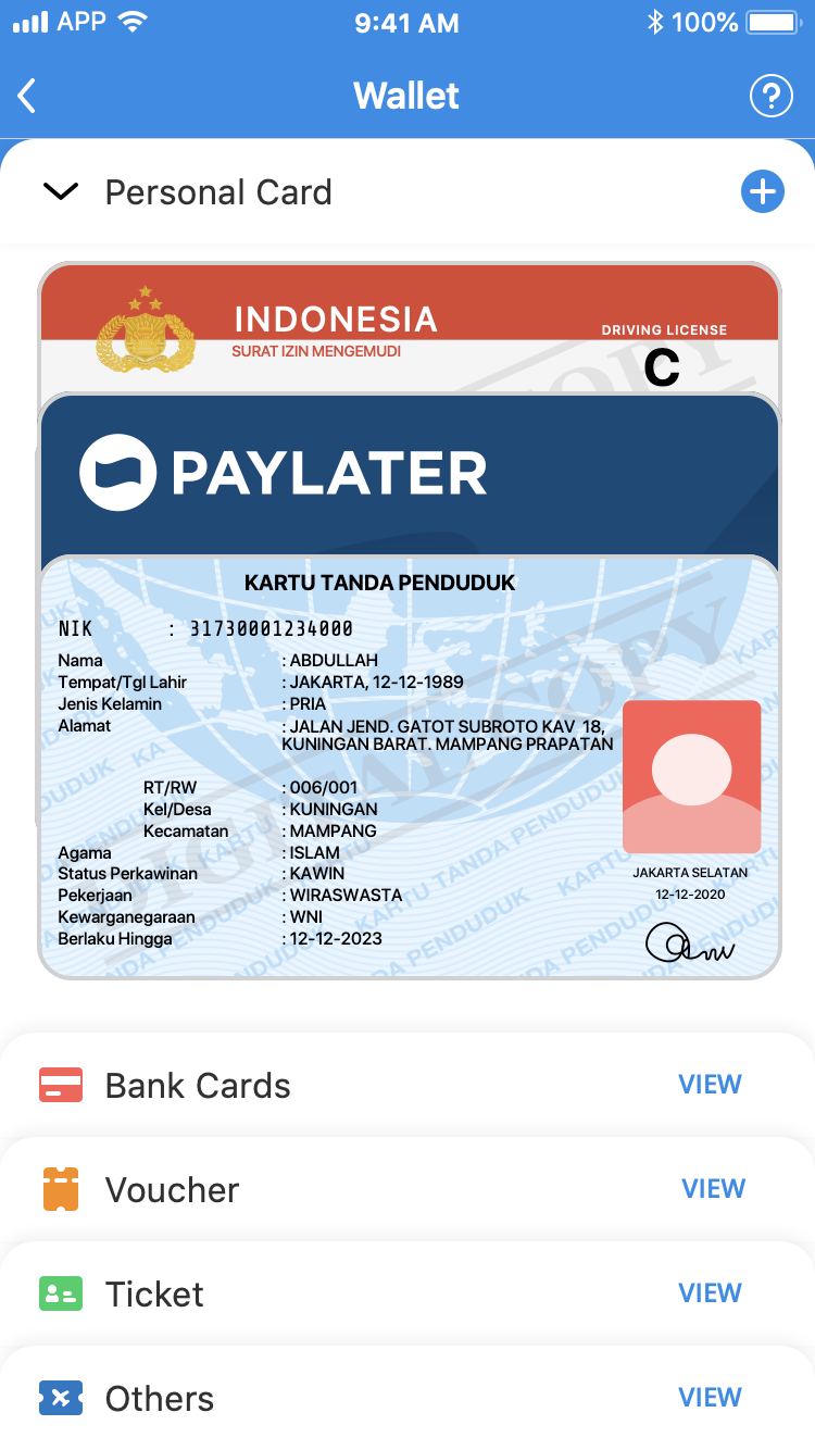
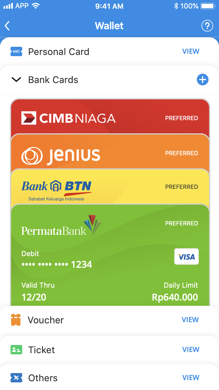
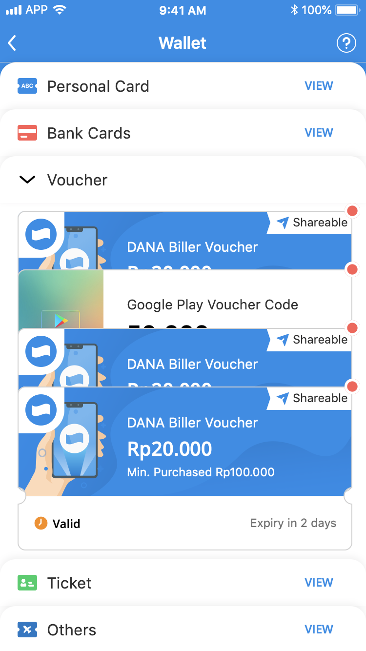
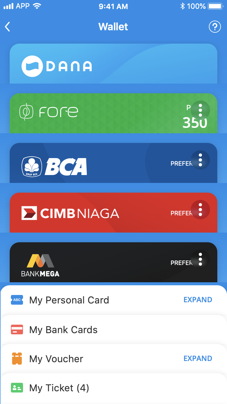
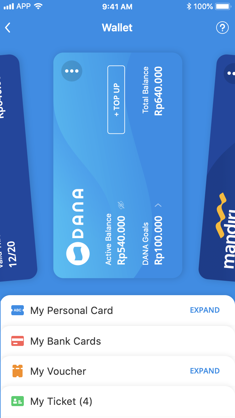
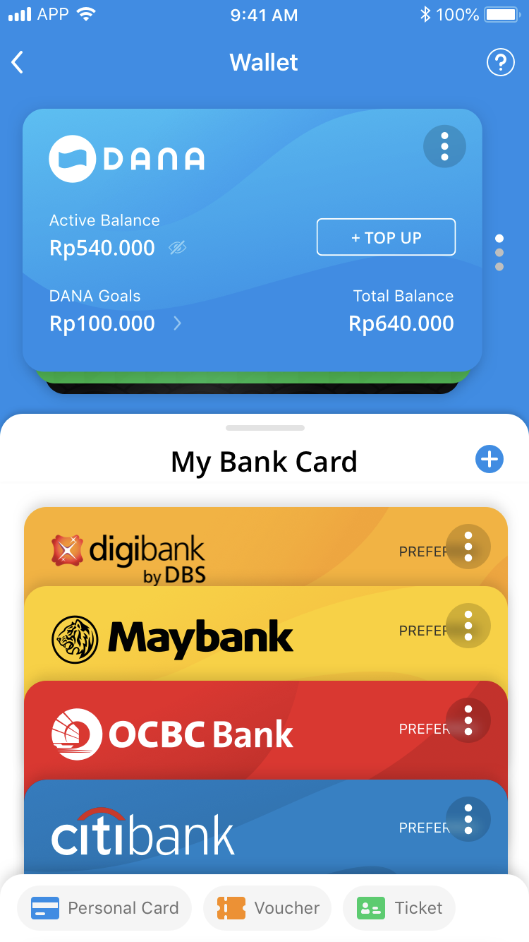
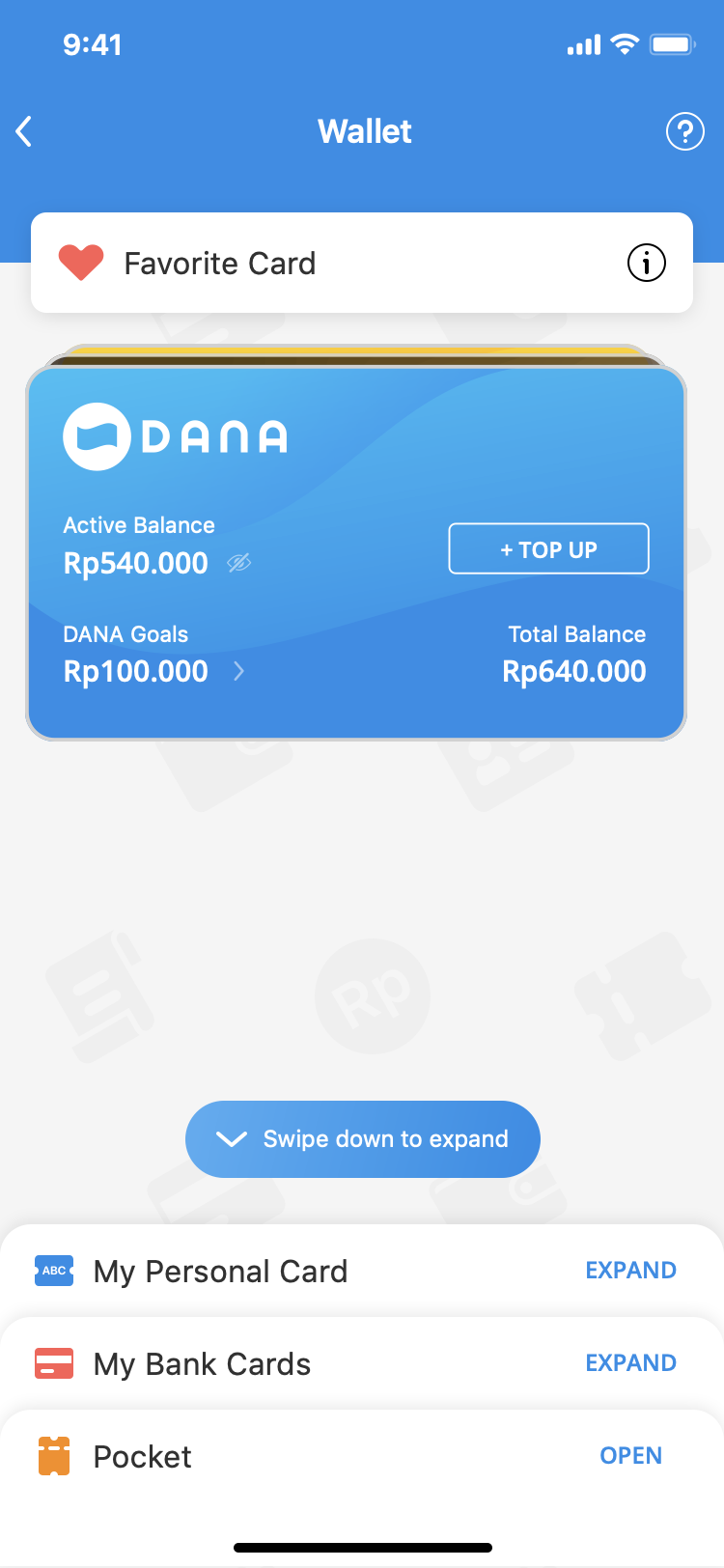
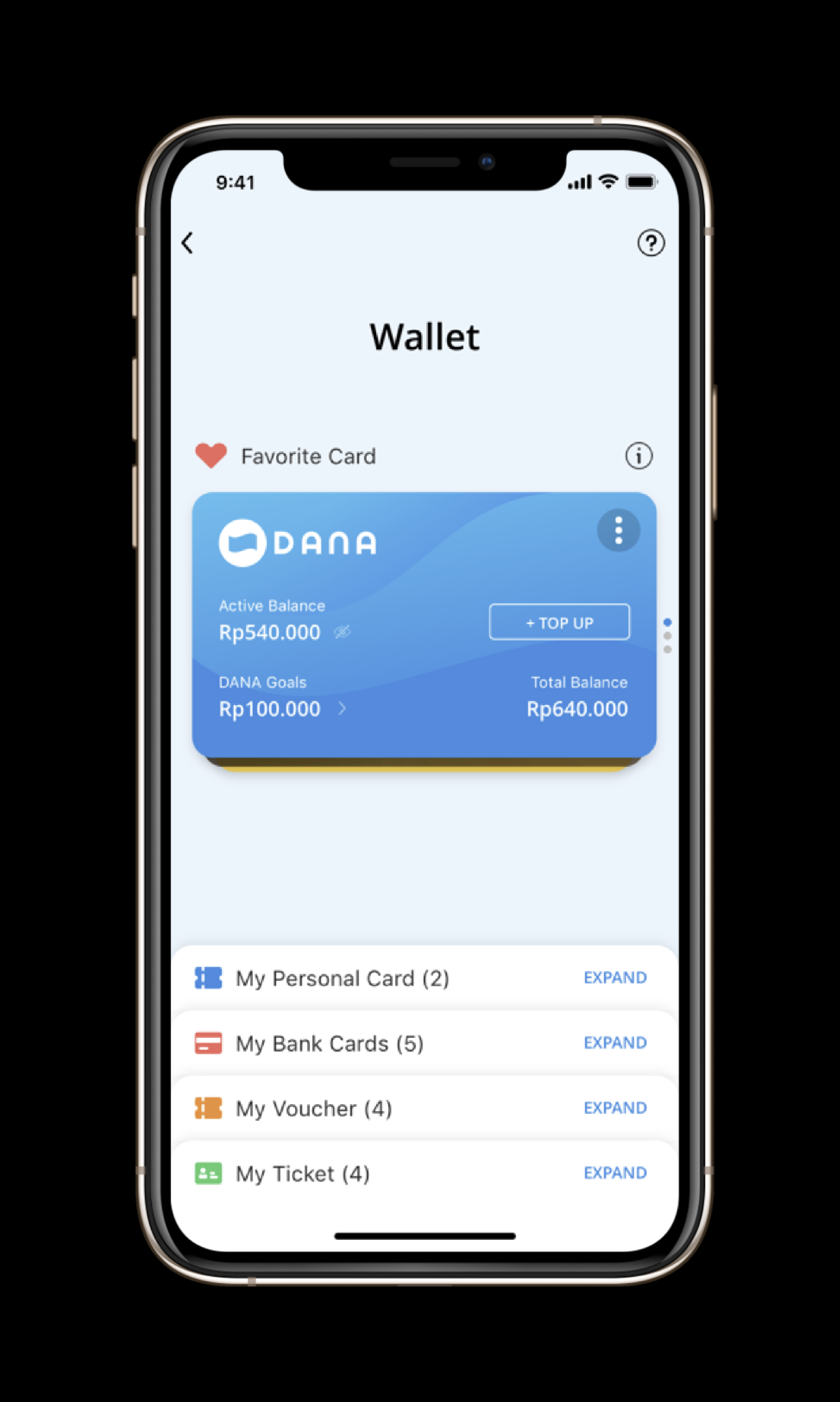
Wallet home: payment methods, vouchers, tickets, and loyalty are visible in one scan.
Five products that felt like five different apps (payment
methods, vouchers, loyalty, goals, investments) turned into
one wallet people could actually trust.
Users often had to figure out where something was before
they could use it.
That matters more here than almost anywhere else in the app.
Wallet actions happen right before a payment, so a moment of
hesitation isn’t just UX friction: it’s someone stalling with
money on the line.
Open DANA’s wallet and everything a wallet needs was already
there: cards, vouchers, loyalty, investment. Nothing was
missing. It just didn’t feel like it belonged to the same
product.
The problem was never the number of features. It was that each
area had its own layout, labels, navigation, its own
interaction patterns. Using the wallet could feel like opening
five different apps that happened to share the same account.
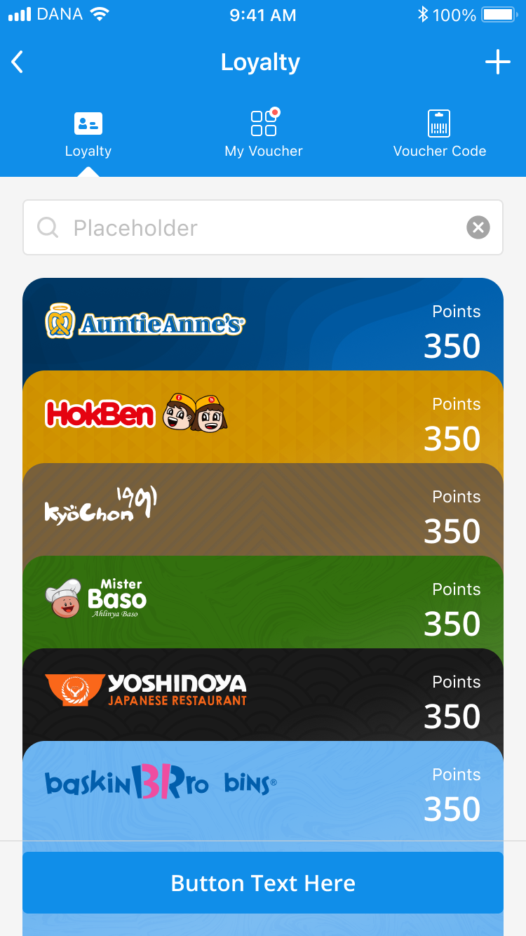
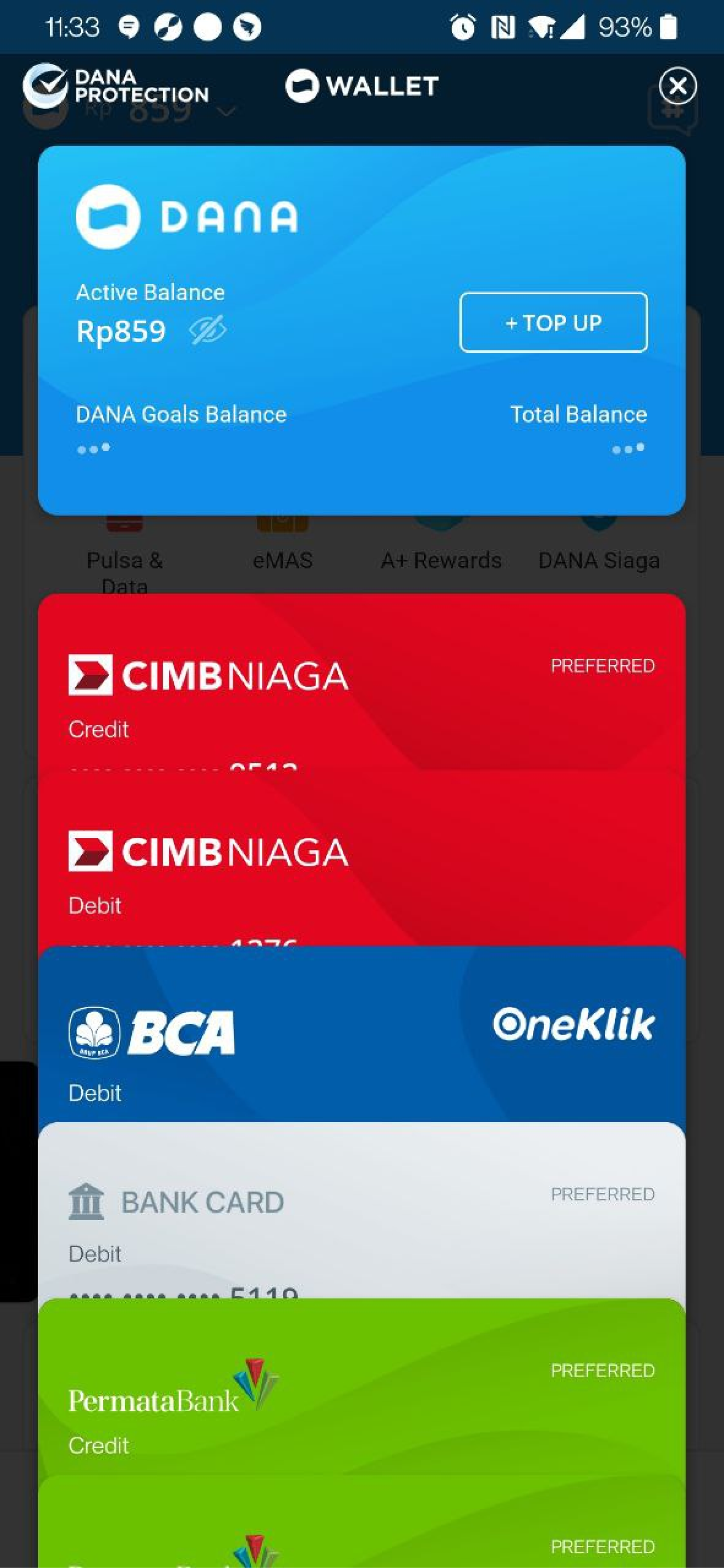
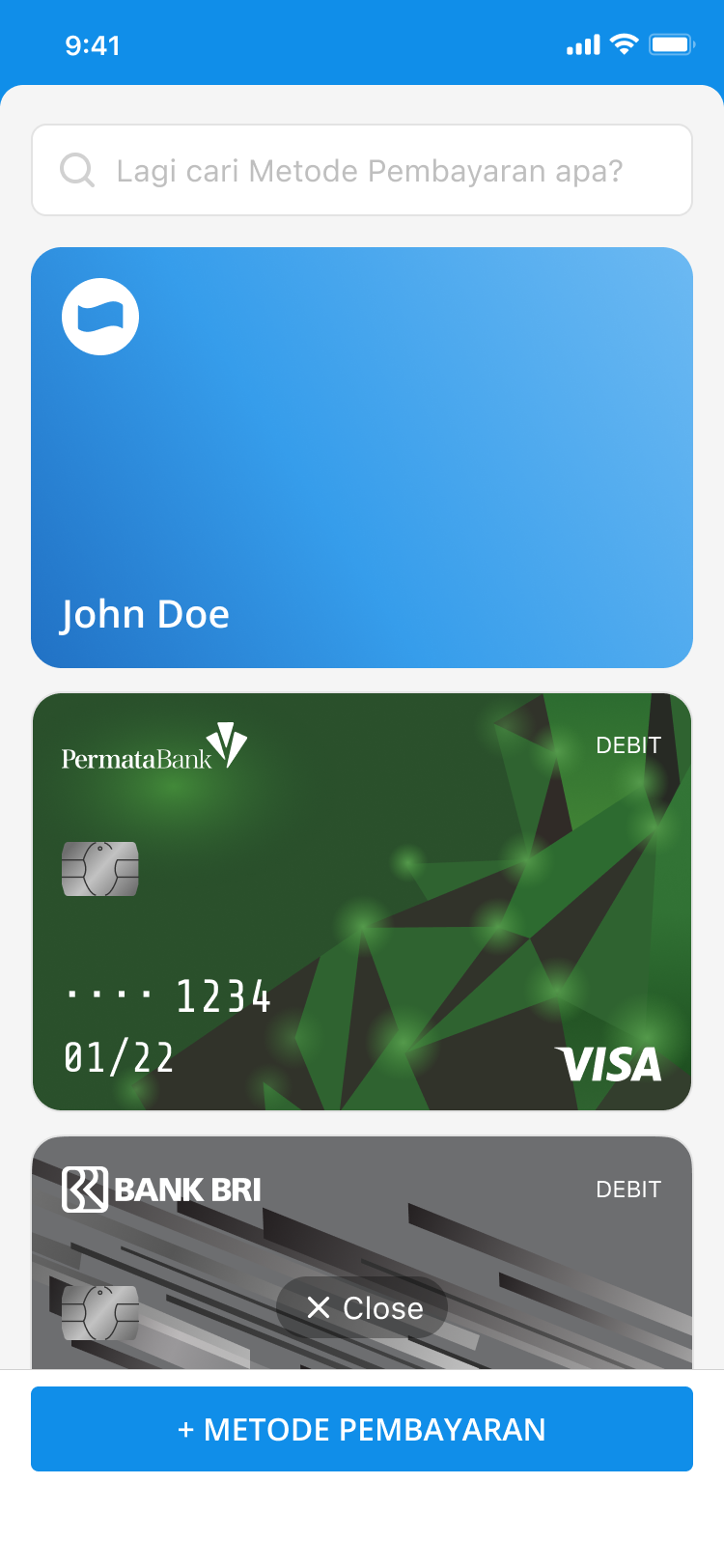
The fragmentation showed up even within a single screen. Cards,
vouchers, loyalty, and other products each used a different
structure and visual hierarchy. Some actions were easy to find.
Others meant digging a level deeper before you’d even reached
them.
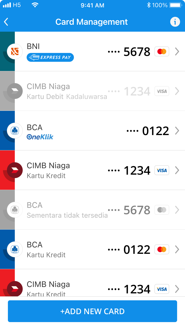
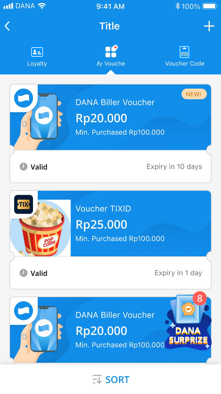
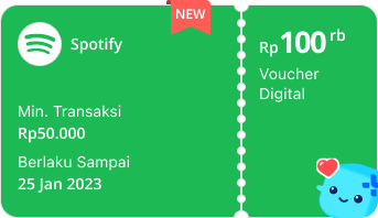
Card ManagementPocket - VoucherPocket - Loyalty
The opportunity wasn’t more features. It was making the wallet
feel connected, so people could understand what they had, find
what they needed, and manage it without learning a new pattern
for every product.
Opportunity: Unify the wallet into one place
where users can manage and choose how they pay, without
relearning a different product every time.
The chapters below are how that changed: what the research
reframed, the model that held everything, and the pattern
that shipped.
The problem was consistency
The redesign was informed by research across Wallet v2, broader
digital wallet research, and Wallet v3 usability testing.
951survey responses
Wallet v2 ResearchSurvey + Usability Testing, with 5 usability sessions. Used to understand existing behavior and discoverability issues.
1,104survey responses
Digital Wallet AttitudesSurvey + In-depth Interviews, with 6 interviews. Used to understand how people think about digital wallets and what they expect.
17usability and interview sessions
5 + 6 + 6 across three wavesThe last 6 were the Wallet v3 Usability Test (Usability Testing + Concept Validation), used to validate the redesigned wallet experience.
Three waves over fourteen months, and the same four themes kept
coming back. None of them matched the mental model the old
wallet was built on:
01. A wallet is more than payments
Users did not only associate their wallet with money. They
also thought about things they owned or managed through
DANA, including bank cards, savings, PayLater, investments,
identity cards, and membership cards.
The wallet imagined as storage only
Design implication
Treat the wallet as a system for managing different assets, not just a list of payment methods.
02. Categories need to be obvious
Voucher, loyalty, ticket, and ID card categories were not
always immediately clear. Users sometimes relied on the
visual appearance or brand of an item to understand what it
was.
Vouchers and tickets treated as peers
Design implication
Use clear section labels and counts so users can understand each category without inspecting individual items.
03. Adoption needs trust
Users liked the idea of having important things in one
digital wallet, but physical wallets still had advantages:
familiar, widely accepted, and a reliable backup. 86% were
interested in adopting digital wallets, while 88% felt
secure using them, but trust was still an important
consideration.
Trust blocking digital ID
Design implication
Security and reliability need to be communicated clearly, especially when putting more financial assets in one place.
04. Control needs to be predictable
Users expected actions such as adding an asset, searching,
changing payment settings, and managing ID cards to work in
familiar ways. When an action was placed somewhere
unexpected or used unfamiliar wording, users became unsure
of what would happen.
The add button nobody could find
Design implication
Keep important actions easy to find and consistent across the wallet.
V3 answered each one structurally.
Finding one model that could hold everything
The research set the constraints. Four bets became
non-negotiable:
Make DANA Wallet feel like one product across cards, vouchers, loyalty, and investment.
Make the wallet easier to scan, even with many cards and products.
Create a structure so new wallet products can grow without new entry points.
Keep users in control, especially around SmartPay’s automatic behavior.
V1
V1: Wallet as a list
The first version was essentially a list of payment
methods. It was straightforward: everything was visible in
one place. But as more products were added, the list became
harder to scan and manage.
What worked
Everything was visible.
The concept was easy to understand.
What didn’t
Little distinction between different types of products.
Harder to prioritize important items.
Managing multiple products felt manual.
V2
V2: Structure begins
V2 introduced clearer sections for things like Balance,
PayLater, and Cards. This made the wallet easier to scan and
reduced the feeling of looking at one long list. But the
products still felt somewhat separate. Users still had to
remember where things lived and how each section worked.
What worked
Better grouping.
Clearer hierarchy.
Easier to scan.
What didn’t
Different products still had different behaviors.
The wallet still felt like several features grouped together.
V3
V3: Wallet becomes a hub
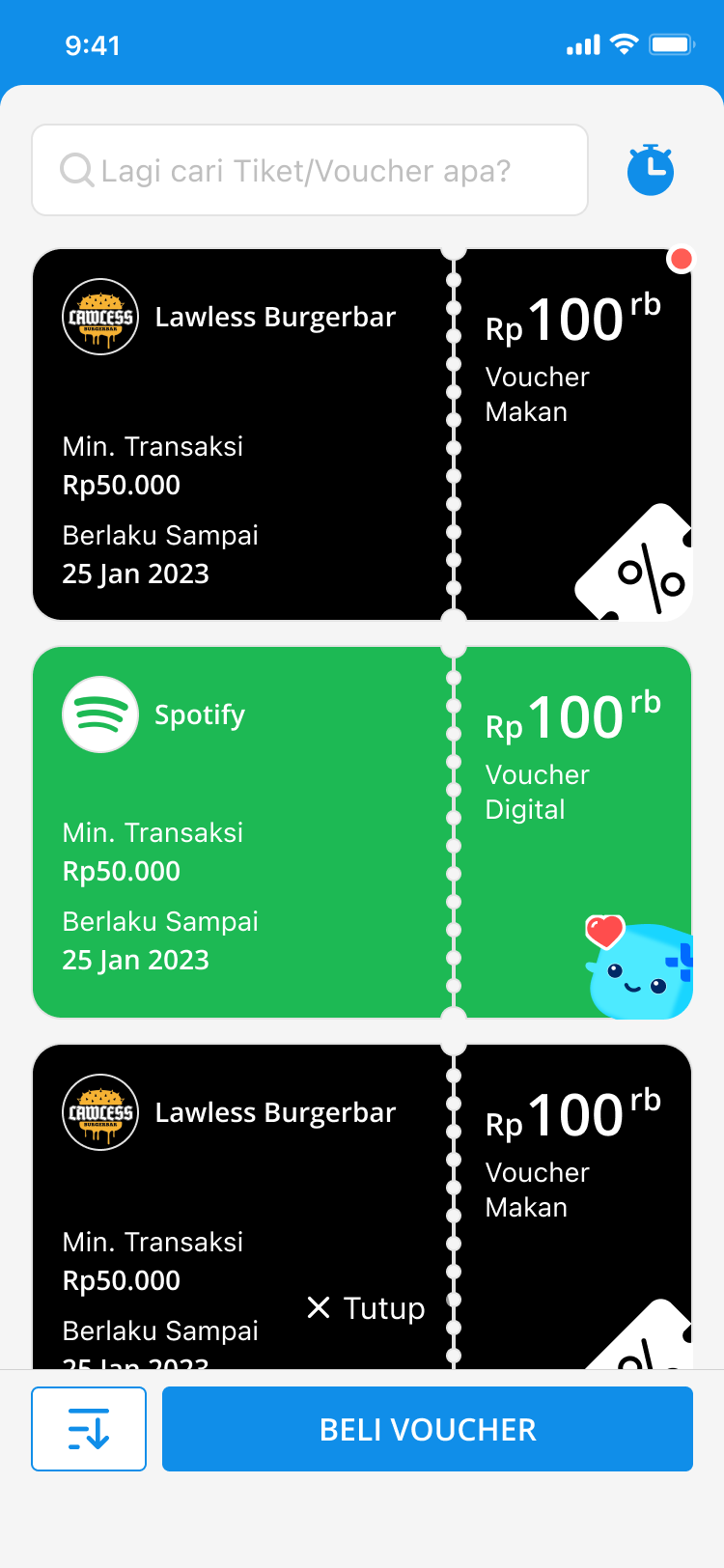
A section expands in place, keeping people oriented while they manage an asset.
V3 was a shift in how we thought about the wallet. Instead of
treating each product as its own destination, we brought them
into a more consistent structure. Products could be scanned
in the same way, managed using similar patterns, and found
through a more predictable navigation model. Search made it
easier to get to specific items, while SmartPay helped reduce
repetitive payment method selection.
The main shift: from a page that stores
payment options to a place that helps users manage how they
pay.
Finding the form
Three explorations clarified what needed to stay visible, what people could prioritize, and what could become quieter.
Pockets hid too much Assets were grouped, but details stayed behind another action.
Favorites improved priority Important assets moved forward without solving the whole system.
A calmer system held together Reduced color and a consistent card model made the wallet easier to read.
DANA Wallet evolution from separated products to one structure.
One pattern, everywhere
The model only matters if it ships. Payment methods anchor
the top, every asset follows the same card structure, and the
same motion carries across pockets, so each behavior is
learned once.
Header Section label and count
Content The same card structure
Shared action One CTA placement
The Payment Methods section, taken apart.
One UI Pattern
The same underlying rules were applied across cards,
vouchers, loyalty, investment, and other wallet
products: card structure, spacing, section headers,
labels, CTA placement, and interaction behavior. The
components did not need to look exactly the same. They
needed to feel like they came from the same system.
Five real Wallet sections adopted the same anatomy: a header, content, and one shared action.
Making Payment Methods the Anchor
Cards and payment methods are some of the most
frequently used and most sensitive parts of a wallet.
So the wallet starts with the user’s most common
question: “How do I pay?” Payment methods
become the anchor, while other assets remain accessible
through the same overall structure.
Ticket & Voucher, 9+ products
Membership, 5 loyalty cards
Personal ID, 2 cards
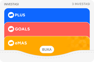
Financial, 3 investments
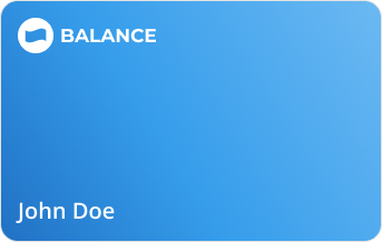
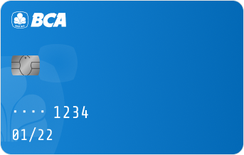
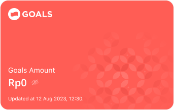
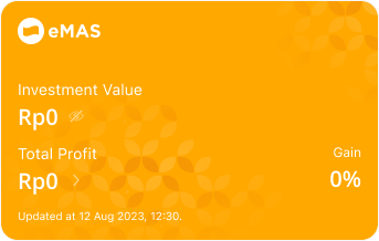
Balance, Cards, DANA Goals, eMAS, and Rewards on one asset pattern
Same motion, vouchers: the same interaction carries across pockets, so the behavior is learned once.
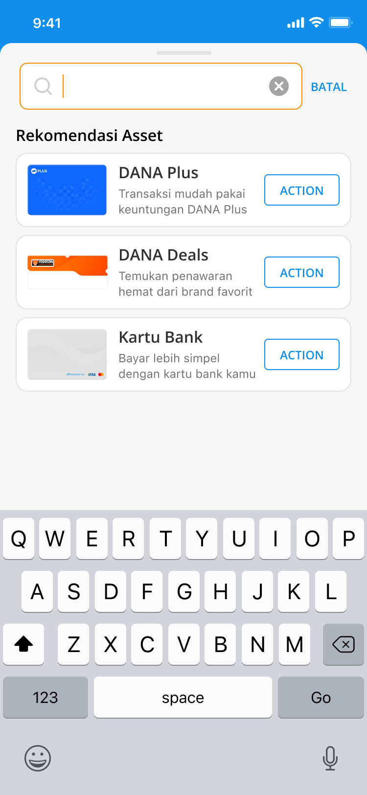
Search that suggests: idle search recommends useful assets, turning discovery into part of management.
Did it work?
The bet on one coherent wallet, instead of five products
sharing an account, showed up in the numbers within the first
cycle after launch. Here is how to read them:
+53.8%*
Total Users
Since V3 launch
+42.4%*
Unique Users
Since V3 launch
>80%
Users with 3+ Assets
Of users hold 3+ assets
Depth over breadth. The KPI the team managed
to was users holding more than the asset threshold: the
multi-asset wallet as the goal state.
*Placement carried part of it. V3 put Wallet
in the bottom navigation for the first time, so some of the
lift is distribution, not pixels.
This project reminded me that designing a financial product is
never just about making things easy to use. People also need
to feel that the product is predictable, and that they’re
still the one in control of it.
DANA already had cards, vouchers, loyalty, investment, and
more. The challenge was never adding another feature: it was
making all of it feel like it belonged to the same wallet.
So the redesign focused on the structure behind the surface:
how products were grouped, how people found them, and whether
similar actions behaved the same way everywhere.
The result was a wallet that was easier to scan, more
consistent to use, and, based on the numbers after launch,
one people came back to more often. Five products stopped
feeling like five different apps. They started feeling like
one wallet that happened to do five things.